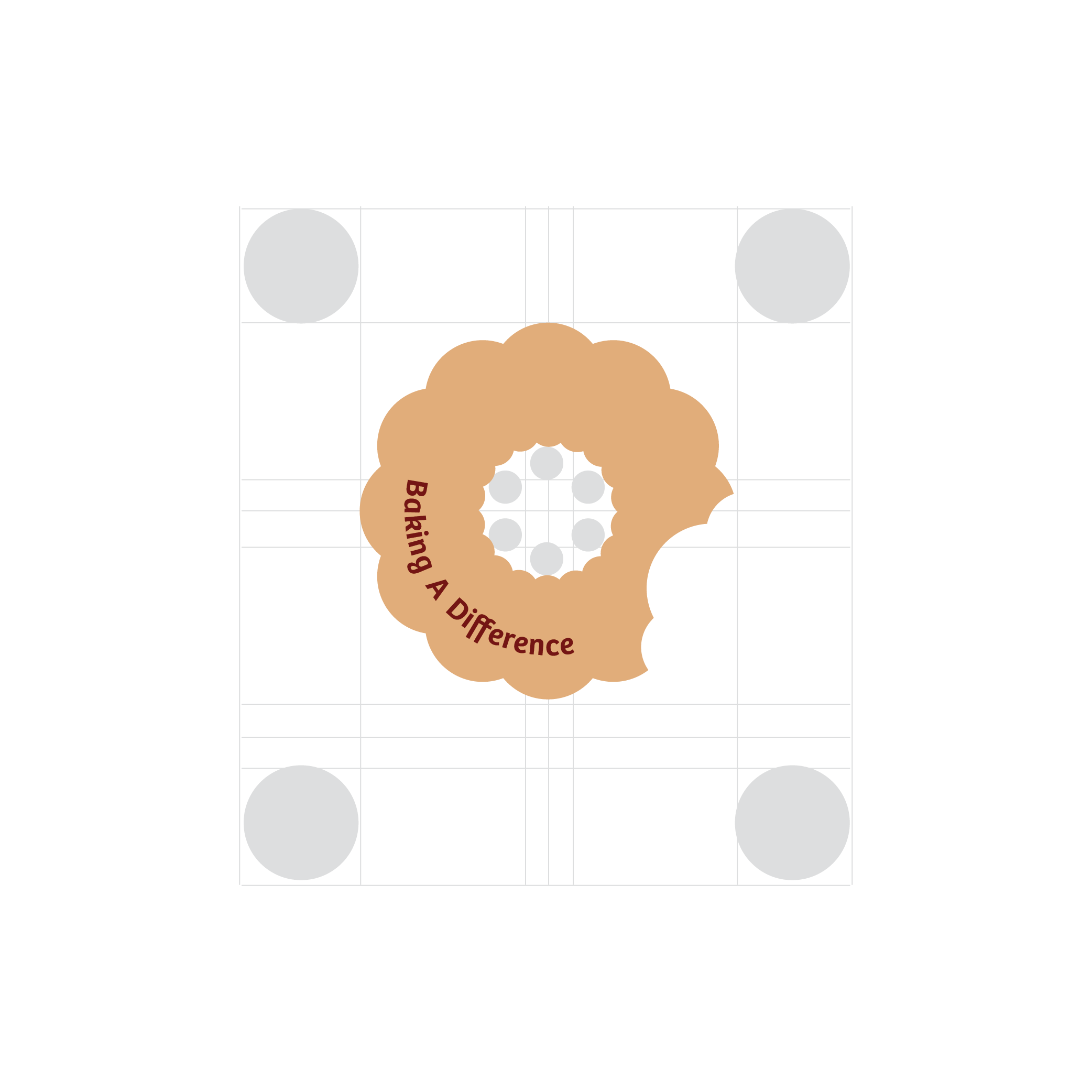
Baking A Difference
2024
Baking A Difference is an allergen-free bakery built on joy, community, and inclusivity. This project focused on rebranding the pop-up bakery to strengthen emotional connection with consumers, streamline user interactions across physical and digital touchpoints, and deliver a warm, trustworthy experience to families, commuters, and food lovers alike. From a refreshed brand identity to an intuitive, mobile-friendly website and truck-based QR integrations, every design decision served a clear goal: make allergen-free treats more accessible, convenient, and joyful.

Welcoming, friendly, and allergen-free—for everyone
Baking A Difference began with a mission to spread joy through inclusive baked goods. As an allergen-free bakery, it caters to individuals and families with dietary restrictions who often feel left out of everyday food experiences. The brand needed a redesign that could capture its heartfelt mission—“Baking A Difference”—while aligning with its growing, diverse audience: busy professionals, health-conscious foodies, and families seeking peace of mind.
The rebrand emphasized not only visual design, but also user interaction and experience, especially across multiple consumer touchpoints like the pop-up truck, digital ordering system, and educational website content.

Research & Interviews
- One-on-one interviews were conducted with key audience members:
- A mother of a child with allergies
- A daily commuter and busy employee
- These interviews helped uncover emotional pain points (like food safety for families) and functional needs (like on-the-go convenience and delivery).
- A competitive market analysis was used to identify gaps in allergen-friendly offerings and digital accessibility in the current bakery landscape.]
User Testing & Iteration
- A website prototype was tested with five users from different backgrounds.
- Their feedback influenced refinements in site navigation, ordering flow, and QR code utility.
- Clear CTAs were added to guide users toward ordering or locating the truck easily.
Key Design Decisions
- QR Code Strategy
- Repositioned with stronger messaging ("Scan to Find Us"), linking directly to truck locations and the order system.
- Website Experience
- Simplified navigation
- Immediate access to allergen education
- Easy pick-up/delivery options
- Recipes and storytelling to deepen brand trust
- Physical & Digital Integration
- Menu of available allergen-free products
- QR code with CTA to direct users to the site
- Unified visual branding for a seamless customer journey


- 100% of test users felt the brand communicated clearly.
- 90% reported an emotional connection with the mission.
- Users appreciated both the educational content and ease of locating/order access.
- The truck experience now reinforces the digital platform, improving brand recall and loyalty.
- Enhanced trust and confidence among families dealing with food allergies.
- Higher convenience and engagement from busy professionals and daily commuters.
Next projects

